Phone first
Designed on a small screen before anything else, then scaled up. The mobile version is never the afterthought.
A nightclub DJ, a children's speech therapist and a leadership author have almost nothing in common. What every one of them needed was the same: to be understood in five seconds, on a phone, by a stranger. Here is what that looks like.
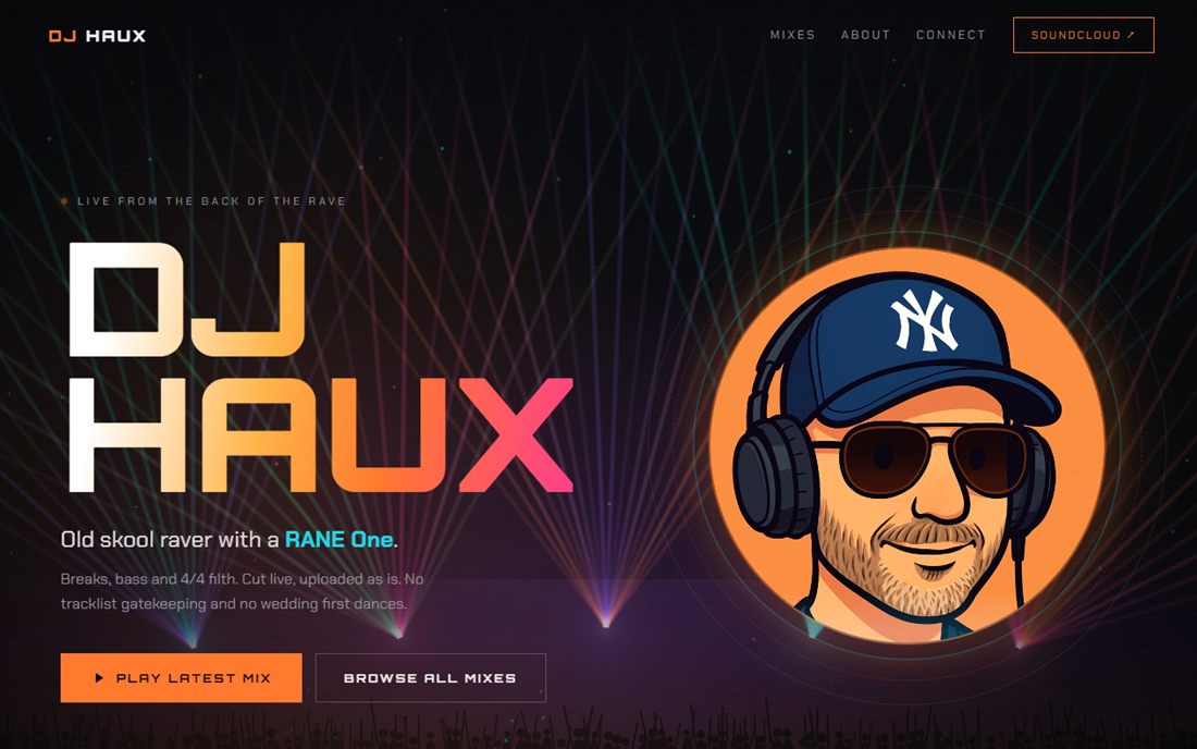
An old skool raver with a RANE One needed somewhere for people to actually hear the mixes. So the site opens loud: huge type, a wall of colour, and the music one tap away. No menu hunting, no splash screen, no “please rotate your device”. It loads in under a second on club wifi, which is the only performance test that really matters here.
Visit djhaux.com
An independent speech and language therapy practice in Reading, serving two very different audiences: anxious parents on a phone late at night, and school SENCos comparing providers on a desktop. The site gives each of them their own clear route in, answers the awkward questions up front, and puts the phone number in front of every visitor on every page. Quiet design doing heavy lifting.
Visit speakingandlistening.co.uk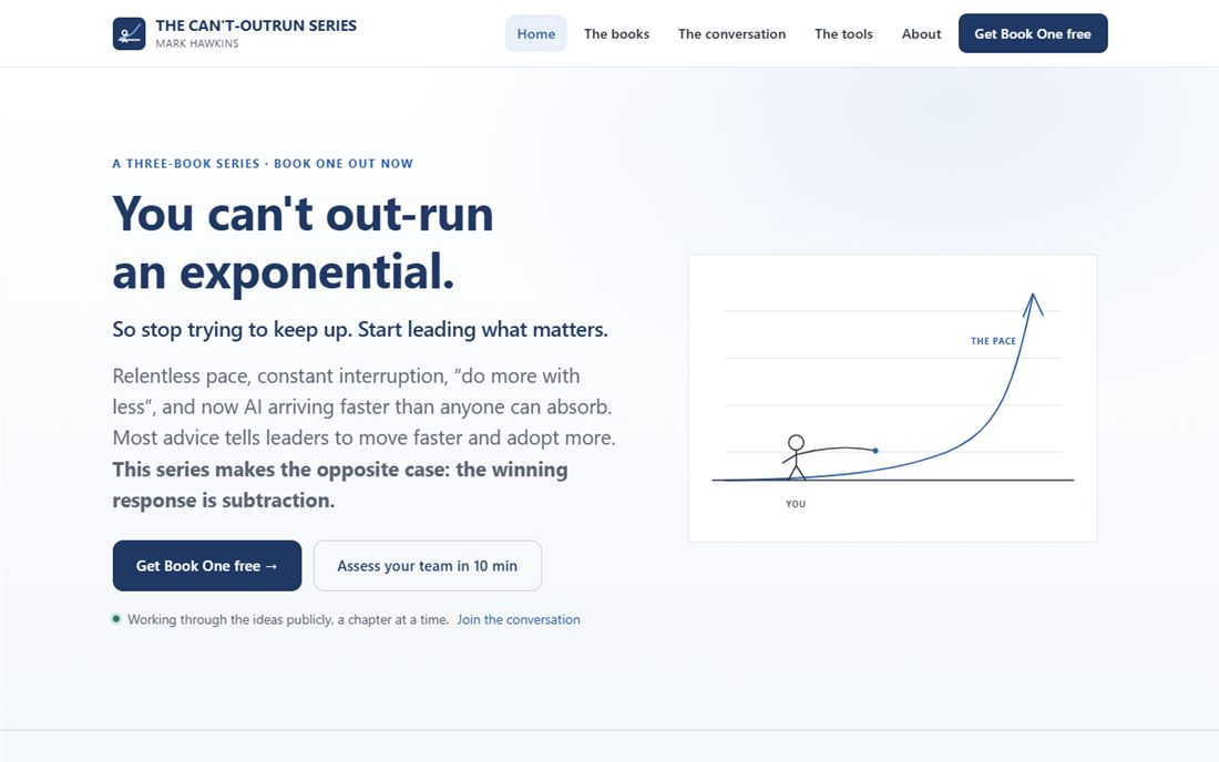
A three book series on leading in an age that will not slow down, plus a set of free assessment and planning tools. The challenge here was volume: a lot of writing, a lot of pages, and a real risk of feeling like a textbook. Big editorial typography, generous white space and a clear spine of navigation keep it feeling like a magazine you want to read rather than an archive you have to search.
Visit cantoutrun.comCompletely different visual worlds, but every one of them is built on exactly the same foundations. Those foundations are what we would bring to your site.
Designed on a small screen before anything else, then scaled up. The mobile version is never the afterthought.
No page builders, no bloated frameworks, no thirty tracking scripts. Hand-built pages that arrive almost instantly.
Every homepage answers “what is this, who is it for, what do I do next” before you scroll. Everything else comes after.
Real text, strong contrast, keyboard navigation, sensible tap targets and reduced-motion support as standard.
Send us your web address and we will come back with an honest review of what is holding it back and what we would do about it. No pressure, no jargon, no sales call.
info@renewedweb.co.uk